Logo Design and Symbolism of Indian Automobile Brands
September 16, 2025


Logo design for Indian automobile brands is a fascinating study of cultural values, technological progress, and national identity. These logos aren't just symbols; they are the visual embodiment of a brand's journey, reflecting India's transition from a nascent industrial nation to a global automotive powerhouse. They often blend traditional symbolism with a modern, forward-looking aesthetic to resonate with a diverse and evolving consumer base.
Symbolism, Values, and Futuristic Ideals
Indian automobile logos are often a narrative of the country's spirit:
Trust and Reliability: Many Indian brands, particularly those with a long history, emphasize trust and reliability. The logos are designed to convey stability and assurance, building on a legacy of serving generations of families and businesses.
Progress and Dynamism: The logos of newer players, or the modern iterations of established ones, often use sharp angles and a sense of motion to symbolize progress, innovation, and a forward-thinking approach. This reflects India's rapid economic growth and its desire to compete on the global stage.
National Pride and Global Ambition: Brands use elements that hint at their Indian roots while also incorporating a sleek, international design language. This dual identity allows them to appeal to a sense of national pride at home and project a globally competitive image abroad.
Case Studies
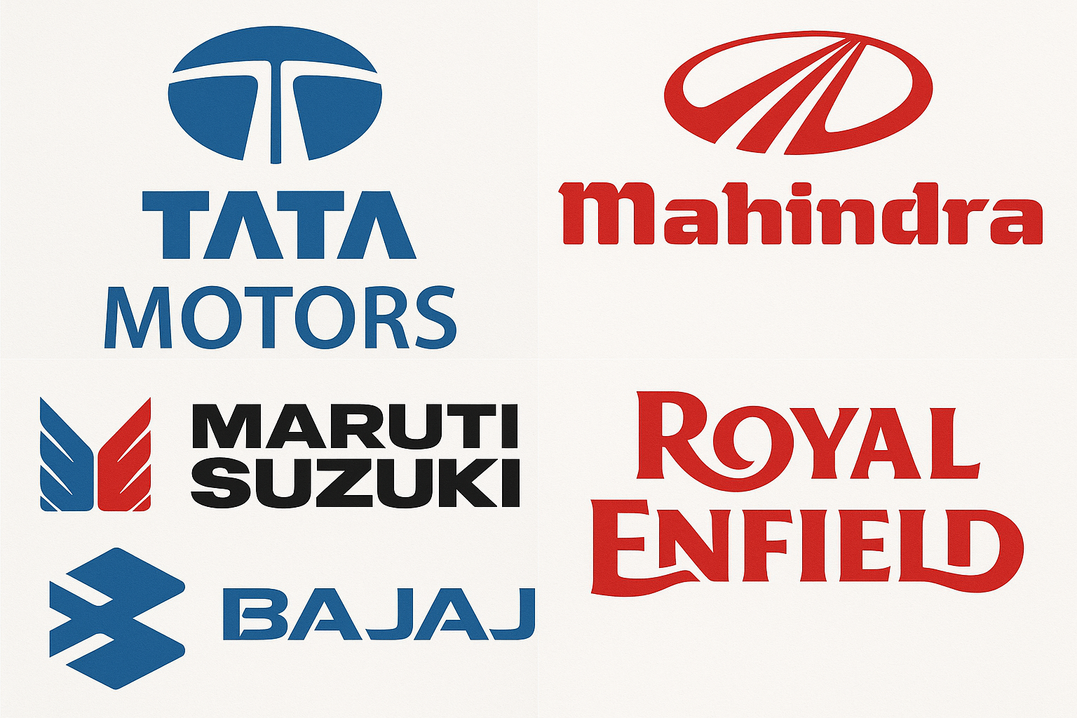
1. Tata Motors
The Tata Motors logo is a stylized "T" enclosed in an oval. While seemingly simple, it's rich with symbolism. The "T" represents trust, strength, and unity. The oval shape, often referred to as the "Infinity Loop," symbolizes a globe, reflecting Tata's global ambitions and reach. The sleek, modern design signals its shift from a traditional manufacturing company to a tech-savvy, future-ready brand. Its transition from a more complex, traditional logo to the current clean, minimalist design mirrors the company's evolution, especially with its recent focus on electric vehicles (EVs) and cutting-edge technology. The logo stands for a commitment to serving its country while also pursuing global leadership in mobility.
Mahindra's logo has recently undergone a major transformation. The earlier logo, a bold 'M' in an oval, conveyed strength and ruggedness, perfectly suited for its tough SUVs and tractors. The sharp, angular lines of the "M" symbolized strength, progress, and durability, resonating with the company's reputation for building vehicles that can handle India's diverse and challenging terrain.
The new "twin peaks" logo for its passenger vehicles is a significant shift. The sleek, symmetrical design represents the company's futuristic vision. The two peaks signify a new perspective, hinting at the brand's aspiration to conquer new heights in technology and design. This rebranding signals Mahindra's move toward a more premium, global image, especially with its new generation of SUVs and its venture into the EV space.
The Maruti Suzuki logo is a testament to its dual heritage. The winged "M," representing Maruti, symbolizes hope and aspiration, capturing the dream of personal mobility for millions of Indians. The stylized "S," representing Suzuki, signifies Japanese engineering, quality, and reliability. The two symbols, often placed side-by-side, visually represent the joint venture's unique identity. The colors—blue for trust and professionalism and red for energy and passion—reflect a blend of dependable engineering and dynamic appeal. The logo’s evolution has always maintained this dual identity, reinforcing its position as India's most trusted and popular car manufacturer.
Royal Enfield’s logo is steeped in heritage. The motto "Made Like a Gun" and the use of the cannon in earlier designs harks back to its origins as a firearms manufacturer in the UK. This slogan is not just a nod to its history; it's a promise of durability, strength, and robustness—qualities that have made the Bullet and other models iconic in India. The current logo, a bold, sans-serif wordmark, is a cleaner, more modern adaptation that retains a sense of timelessness. The deep red color of the logo signifies passion, energy, and a love for motorcycling. Its logo connects a rich, almost 120-year history with a contemporary brand identity, successfully capturing the imagination of both traditionalists and new-age riders.
5. Bajaj Auto
The Bajaj Auto logo has undergone a significant transformation from its original hexagonal "B" to the current "Flying B." The old logo, a stylized 'B' within a hexagon, conveyed stability and precision engineering, becoming synonymous with the reliable "Hamara Bajaj" scooters. The shift to the modern "Flying B" is a powerful visual metaphor for change. The two arrows in the logo, pointing upward and forward, signify progress, dynamism, and global ambition. This new emblem reflects the company’s evolution from a domestic scooter giant to a global motorcycle powerhouse, emphasizing speed, innovation, and a vision of being "The World's Favourite Indian." The logo is a bold statement of its forward-thinking approach and its continuous drive to expand its international footprint.
Want more branding articles to be utilised for growing upwards? Connect with us on
contact@upshotbrandmedia.com or on call at +91 8962429492
Tags: